Pointers for creating the perfect fund fact sheet
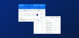
If you work in Fund Marketing, then you know the importance design plays in communicating fund information to investors. From getting your branding spot on, to using chart labels, it’s the details that count and make your documents stand out in a crowd. At Kurtosys we combine professional desktop publishing software with a team of experts and our own automation platform to produce your fund fact sheets at scale.
1. COLORS – LESS IS MORE
Use only your corporate color scheme – if you need more colors use neutral tones like grays and shades of your main color(s).
2. TABLES – AVOID VERTICAL RULES
Vertical rules in tables can be ugly and visually distracting. Try using alternating row tints and more white space instead.
3. DON’T USE A PIE CHART
Pie charts can be misleading. Would a bar chart tell a more accurate story? Can also work better for mono printing.
4. LOGO – USE EPS FILES
Make sure you use EPS (vector-based) images for logos.No one wants to see a pixelated logo on your beautiful fact sheet!
5. USE FUND MANAGER PHOTOS
Use high-quality photos to accompany fund manager commentaries/bios. People images bring your fact sheets to life.
6. USE LABELS ON CHARTS
Try using labels on charts to highlight the important information you want your readers to see.
7. CUSTOMIZE RISK RATINGS
Create a custom risk rating with your branding. Your compliance team will be happier, your readers will be better informed.
Learn more about our Automated Fund Document Solution for asset managers.