Content comes in many formats these days, with an added onus to stand out in the oversaturated world of marketing through originality.
Blog posts remain the flagship tool for fund marketers to discuss industry insights and develop opinion pieces, but in the grand scheme of content generation they act as somewhat of a stepping stone to more modern, cutting-edge techniques to reach audiences. Podcasts and video content are ways to capture the attention of new and existing clients, particularly the ‘millennial’ band, similarly perfect as shareables for social media.
That being said, infographics are in fact top dog for social sharing. Hubspot note that these humble (or grand) graphics are ‘liked’ and ‘shared’ three times more than any other form of content. Why risk hours of writer’s block when you can format such content as: survey results; thought leadership quotes; market trends; or monthly report summaries? Perhaps even all of these in one long-form example.
You don’t have to be the most experienced designer out there to create eye-grabbing graphics, with multiple services available to help marketers build them by themselves. We’ve checked the social accounts from leading asset managers to find the most striking examples of infographics we could find!
In no particular order
Old Mutual Global Investors
One of the most creative deliverers of infographics are Old Mutual Global Investors. Much of the content revolves around survey results to highlight investment trends, but all are duly branded with trademark green shades and company logo. Clearly using skilled designers, the informative content is always accompanied using relevant illustrations to accentuate the topic. For example, this presentable M&A feature takes on a UK-based company ‘bidding war’ graphic to great, cartoonish effect.
M&A interest in UK assets has been heating up: @comcast for @SkyUK, @KlepierreGroup for @Hammersonplc, @Michelin for @FennerPLC https://t.co/cSt3P8rpzd pic.twitter.com/4QjF43j1c0
— OMGI (@OMGI) March 26, 2018
Fidelity Investments
Focusing particularly on the quantitative side of things is Fidelity Investments. Rather than long-form graphics, this firm instead opts for bitesize titbits of information, each one able to be shared as a separate tweet to accompany a relevant piece of written content. Such examples include their regular #chartoftheweek feature (self-explanatory), as well as comparison charts which aim to target multiple users at once. We particularly like this ‘type of account’ differentiator.
Knowing your tax rate & spending style can help you choose between a Roth IRA and a Traditional IRA: https://t.co/AKmOIFPzdI pic.twitter.com/4TT4YIfpcA
— Fidelity Investments (@Fidelity) June 17, 2018
Loomis Sayles
Social media marketing assists greatly with the regularity of content, infographics included. Loomis Sayles adopts the format to present its monthly market overview, named ‘Global Growth Themes and Forecasts’. Whilst the full-size version can be found on the company’s website, their Twitter feed breaks the information down continent-by-continent to segment the useful stats and updates. The graphic is clean and minimalist in both formats; the regional approach lends itself well to the focused presentation of growth across all markets.
We expect the #euro area’s solid expansion to march on in 2018 with continued above-potential growth. More in our quarterly global growth #infographic: https://t.co/FHyF38CthY pic.twitter.com/5OZOdn7I6J
— Loomis Sayles (@LoomisSayles) May 28, 2018
Woodford Funds
Woodford Funds’ marketing centrepiece is Neil Woodford’s ‘The Bigger Picture’ articles, an example of which you can check out here. One of its standout features is the infographic. In a bold black and yellow colour for added familiarity, they’re heavy on statistical information and greyscale photography. Much like the aforementioned example, regional investment events are divided accordingly via multiple tweets, but also grouped together in a Twitter thread for users to access all of the information in one go; a simple yet useful feature.
Nomura
Re-shareable, updated infographics are an excellent way to strategically repurpose your best content. This is clearly utilised by Nomura, particularly for their ‘Risk Radar’, which determines the magnitude of certain political events in relation to financial markets, and they are quick to update the graph monthly as the year pans out. The graphic effectively segments markets by area (EMEA, ASIA and AMERs) and is as radar-esque as the name suggests, with bold flags pertaining to country events. A recent example with deeper written insights can be found on Nomura’s insights page.
We’ve updated our #risk radar pic.twitter.com/f7ECrP7DKL
— Nomura (@Nomura) April 11, 2018
Holborn Assets
A key facet to social media is the chance to share great content for yourself. Of course, the humble infographic is perfect material for this, with some extremely talented designers out there. Whilst Holborn Assets weren’t the original creators of this noteworthy gem, they still brought it to our attention. Sellhousefast.uk made this wonderful snakes-and-ladders style property game to plan for a mortgage, also created around the time of the latest buzzworthy series of Game of Thrones. Tapping into popular culture goes far in making infographics all the more shareworthy.
We’re loving this @GameOfThrones themed mortgage journey #infographic! Ready to start your adventure? #HolbornAssets #Mortgages #Home pic.twitter.com/m3C5kgpZLX
— Holborn Assets (@holbornassets) September 19, 2017
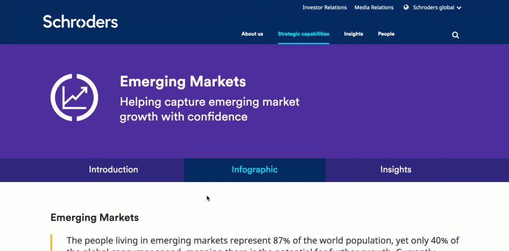
Schroders
Schroders have utilised this format as just one way to identify investment capabilities. The ‘strategic capabilities’ section on the website segments each, and features introductions, market reports and video. The infographics are particularly striking however, featuring excellently vivid world maps, timelines and accompanying statistical information aplenty. The main draw here, however, is that they are animated, adding some creative flair which dazzles and balances the more quantitative data perfectly.
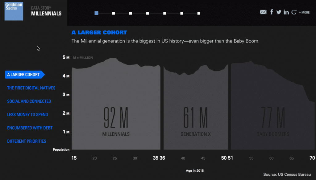
Goldman Sachs
We’re perhaps all aware of the infographic offerings from Goldman Sachs, who have always been ahead of the game. This spotlight – Millennials: Coming of Age – was released a few years ago now, but still looks as fresh as ever, with amazing animated graphics sitting next to hoards of survey results looking into the millennial mindset. It’s also interactive in parts, making toggling through their larger topics far more exciting than the average infographic. Another brilliant example is this future of cars feature. With a higher budget, infographics can clearly be taken to the next level.
From small-scale to large, infographics can be another great way to market your insights, survey results or company culture via social media channels or a website. They’re a flexible format, and are definitely worth the time and investment for any asset manager.
Seen any exciting uses of infographics in financial services recently? Let us know in the comments below or send us a Tweet!