Asset management often gets a tough press in regards to modern marketing. Known as a laggard in the seismic shift of technological advancement, on top of this, the overlooked staple of brand awareness can get left behind in the dust unless being reimagined every now and again. Digitalisation has had a major impact on rebranding. Whilst we like to research and commend updated asset management websites from a design perspective, we also maintain a key interest in the fairly irregular practise of logo revamping. The logo acts as an asset manager’s most instant eye-catching feature, and many companies seek the expertise of third party design agencies to perfectly capture a forward-thinking message with sleek, modern design.
Luckily, we’ve dug deep into the web to see exactly how asset managers have embraced the new logo revolution. From then to now, here’s a selection of the industry’s logo rebrands, from the sensational to the subtle, the majestic to the minimalist. When it comes to logos, there’s more than meets the eye.
AllianceBernstein
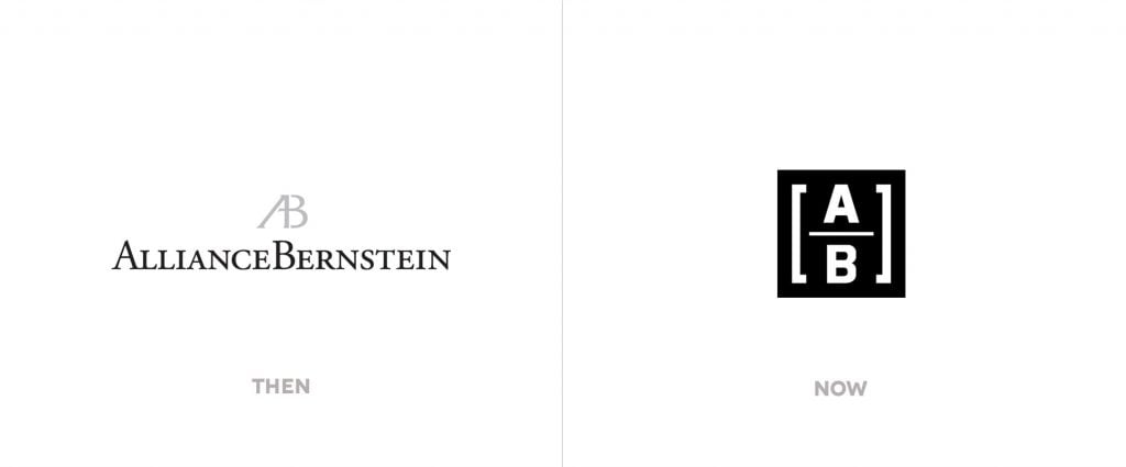
New York-based AllianceBernstein launched a whole new brand initiative in 2015. Under a succinct rebrand as ‘AB’, it’s Ahead of Tomorrow campaign saw a new mobile friendly and streamlined web address, and this minimalist dual tone logo matches their restructured branding with a linear format.
Charles Schwab
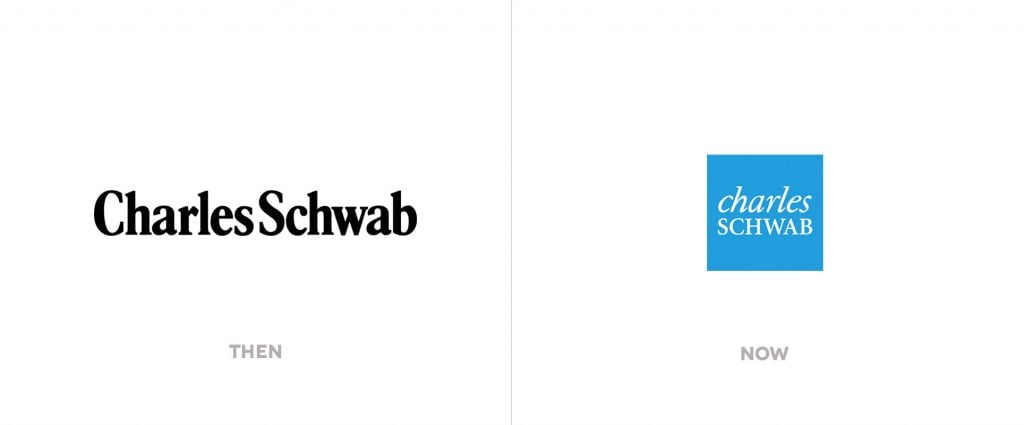
This earlier logo served Charles Schwab for thirty years, starting in 1971. What we see today is a complete overhaul in terms of font, use of italics, and a white-on-blue ‘icon style’ logo which freshened up an old school look which the brand was clearly trying to relieve.
Legg Mason
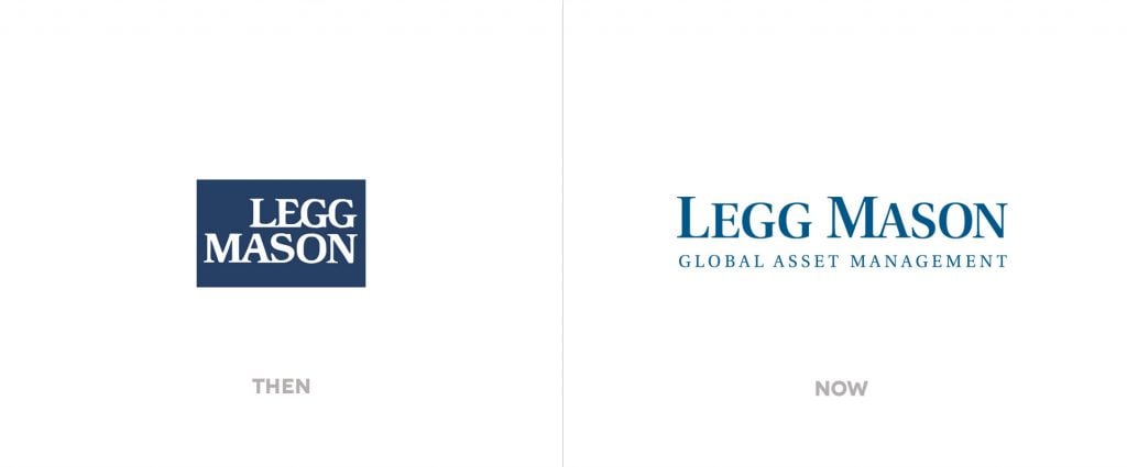
Whilst an earlier form of Legg Mason’s logo looked at home in the seventies and eighties, it’s logo nowadays is neat and professional, retaining its trademark blue branding whilst accentuating its global focus.
MetLife
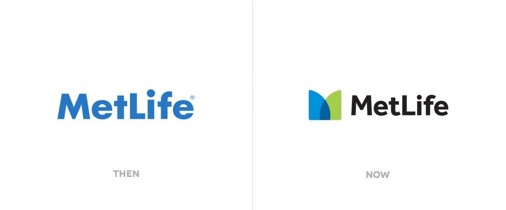
After a 31 year partnership with the Charles Schulz family and Iconix (where Snoopy became a MetLife brand ambassador), in 2016 this rebrand brought a sublime new logo, with clean typography and a vibrant blue and green overlap reflecting diversity and cohesion.
Northern Trust
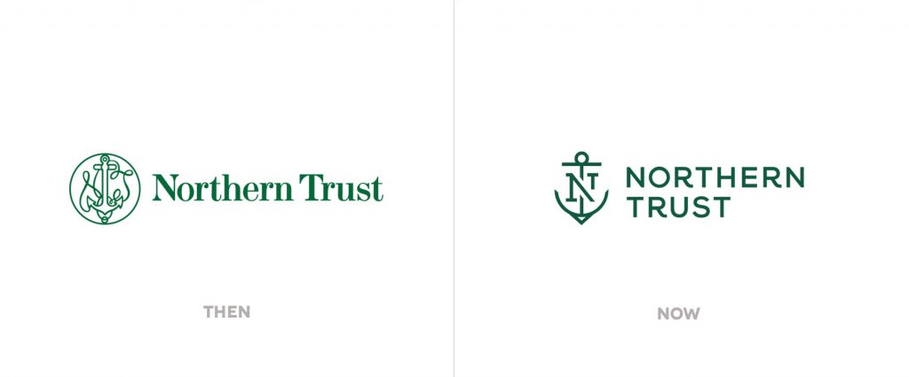
Opting for a more simplistic, modern logo is Northern Trust. The company has maintained the nautical branding that made it famous, but their current logo trades in the more flowery anchor design for a sleeker icon, swapping the serif typeface for a more modern sans-serif face.
RLAM
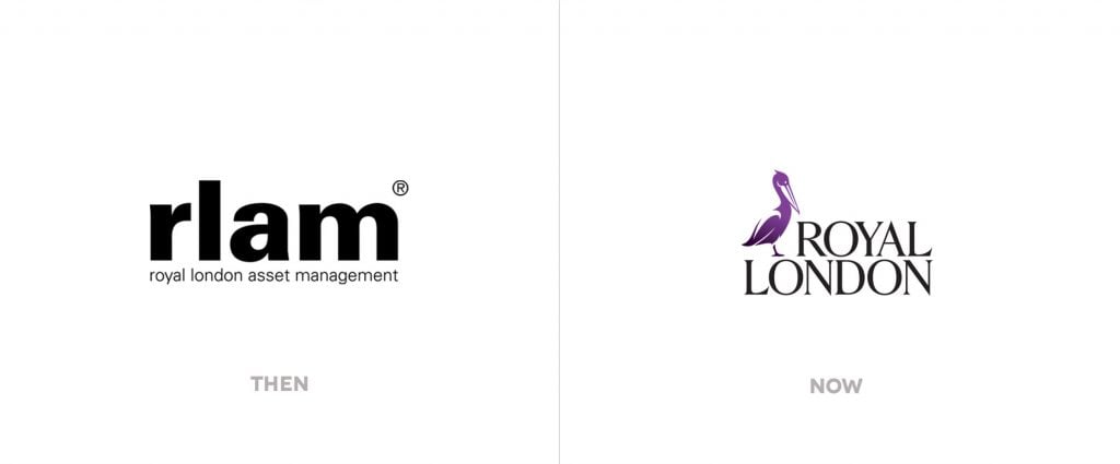
RLAM’s original logo here was straightforward, but in 2014, the addition of a pelican identity has proven to underline their rebrand most, alongside a new typeface. Designed by Brand Union, the pelican was chosen due to the animal’s “royal connotations”, its role as a “provider”, and being a “symbol of generosity”.
Santander
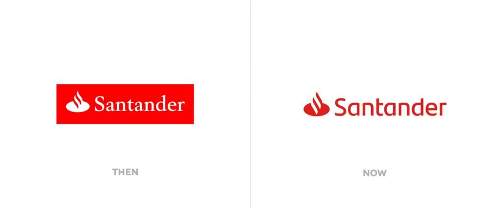
This subtle logo rebrand from Santander only surfaced this year, remaining fairly similar to its 2009 version, but took on a more contemporary look using a simple switch from ‘serif’ to ‘sans serif’ typeface. The brand-establishing flame remains.
Schroders
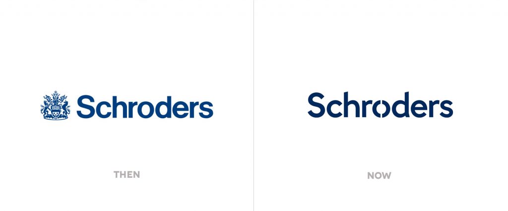
Last year, Schroders unveiled a brand new website to our acclaim, and a revolutionised logo. Schroders have opted for subtlety this time around, replacing its ‘coat of arms’ with a modification in the ‘O’ (a “lens”) and using a slightly modernised typeface to emphasise innovation.
State Street Global Advisors
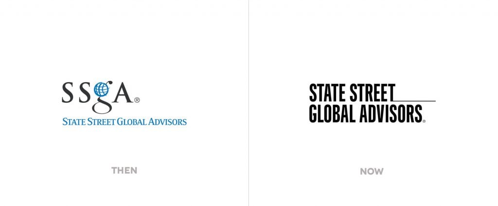
Possibly the most minimalist and stylish logo change comes courtesy of SSGA; it’s grey and blue original has transformed to a bolder typeface which is no-nonsense, and is complete with a line to reflect the eponymous street in a simple yet effective design feature.
T. Rowe Price
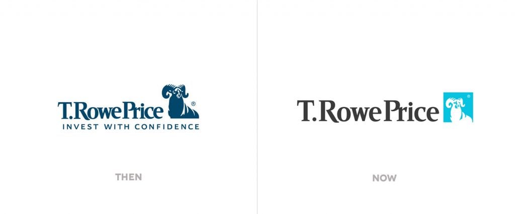
Fairly subtle in its revamping is this recent update from T. Rowe Price. Maintaining it’s bighorn sheep mascot (who serves as a symbol of their “culture, values, and investment philosophy” – outlined here), the company heightens its importance, and their brand name, with the dropping of a slogan and utilising a refreshing sky blue colour scheme.
A complete logo overhaul may seem a drastic step, particularly if it changes the complete look of an established brand, but even just a subtle alteration can provide an instant refreshment. Whilst it is recommended to update your website every three years or so, the logo will not need quite so much reimagining, but by following modern design trends this will help to keep the shifting attentions of existing and new customers alike