Our new infographic shows fund flows as a percent of total assets over the past 10 years
Some so-called “emerging markets” from 2004 look decidedly mainstream today, while other “safe bets” have been thrown into disarray.
The US, Eurozone and others experienced the financial crisis 5 years ago that sent shockwaves around the world, sank household names, shook the entire financial community and almost brought whole countries to their knees, while Asia has shown its tiger credentials and the rest of the BRICS have continued to rise.
Yes, a lot’s happened in ten years. Lots of history. Lots of news. And lots of money flowing in and out of fund categories as a result.
Ten years of fund flows into mutual funds, including ETFs are pictured below. The calculations come from fund-tracking firm EPFR Global and Deutsche Bank and we’re proud to have combined all of that data into one beautiful financial chart because we really do believe that data can be beautiful. It’s our passion here at Kurtosys.
So what trends can we identify in the fund market?
Last year saw an outflow of funds from the global bond markets into developed-market equities (most notably Japanese equity funds). In bonds, only corporate high-yield funds saw a significant net increase in 2013. This is no surprise because investors where chasing yield.
While total equity fund flows were net positive last year, the inherently volatile emerging market funds saw notable losses, and emerging bond funds suffered from near-record investor defections.
The global crisis of 2008 glows most red. Only money market funds saw a net gain in a year rocked by sharp economic losses.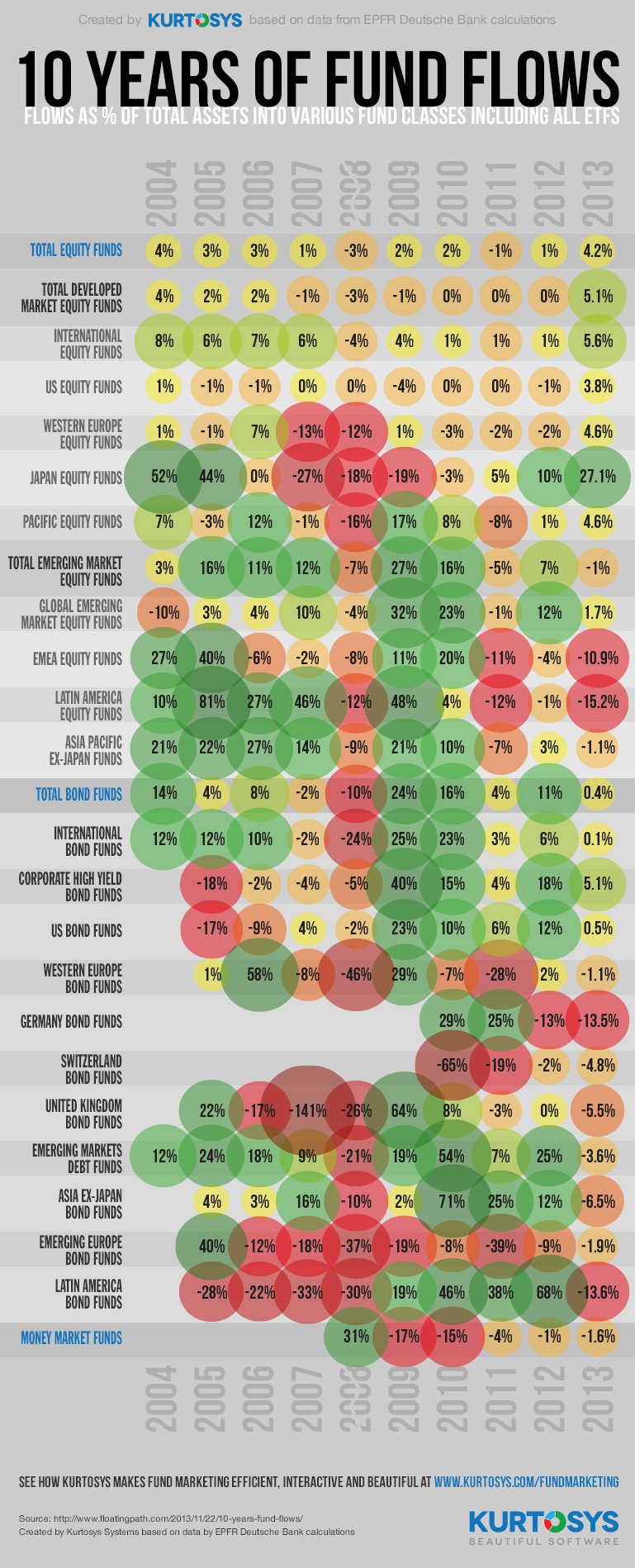
Source: http://www.valuewalk.com/2013/11/10-years-fund-flows-one-chart/
Created by Kurtosys Systems based on data by calculations by EPFR & Deutsche Bank.