Content marketing has become a lynchpin in many financial institutions marketing departments. Despite the asset management industry being late to the party, there’s been a huge increase in websites being launched as dedicated content hubs as well as more regular content like blogs, news and insights appearing on fund manager websites.
70% of B2B marketers are creating more content than they did one year ago
—Content Marketing Institute report, 2015
But there’s one common trend that we’ve noticed: Fund marketing content has no real connection with the fund data that the text is referring to. In other words, an article about fund XYZ from a fund manager does not include real data about fund XYZ. Now there are likely many good reasons for this lack of alignment, but the main one is that most websites (or rather the CMS’ controlling them) are not flexible enough to add dynamic fund data on the fly. The templates are set for blog/news/insights content and the user can not easily add extra content like fund data widgets.
Take a look at this example from Invesco’s blog – an article titled “Oil stocks are cheap, but for how long?”. Towards the end they mention one of their own funds, the Invesco Energy Fund and have inserted a link to the specific fund page.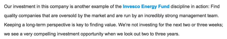
Imagine how much better that article would be if the real performance data was embedded into the page, or maybe in the sidebar.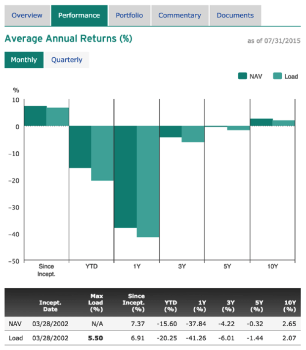
Using custom images or annotated charts
There are plenty of good examples of asset management blogs that have put considerable effort into creating custom chart images, often with annotations or labels to accompany articles. The BlackRock Blog uses images like this S&P market growth chart and the M&G blog Bond Vigilantes create custom charts to illustrate points made in the editorial.
These images bring the articles to life. The charts are static images for good reason – you can’t easily illustrate a point with a dynamic chart. However, if there were dynamic fund performance charts or top performing fund tables included somewhere on the page, it could enhance the user experience even further.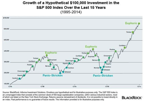
How the sports industry aligns editorial with data
The sports industry is a good example of how data should be aligned with content. The BBC Sports website knows that their audience wants to see key pieces of information. With football (soccer) being a sport reliant on data, they have built a system that allows their authors to append useful statistics to any article.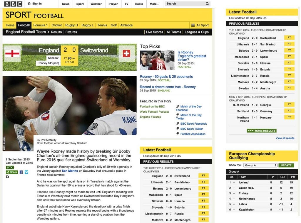
This page on a specific England match for example, uses the sidebar to include the previous results in that competition and also the group table that England belongs to underneath. The user can also access all the groups info without leaving the page – the combination of editorial content and real data combine to produce a more immersive user experience. Incidentally, the BBC get their sports data from Opta – and it is presumably piped into their webpages through an API, which is the same as fund data being supplied to investment websites from suppliers such as Morningstar or Lipper.
Creating a better user experience
The news and sports industries are good examples of how publishing systems allow authors and editors more freedom to include as much relevant information as possible. Rather than separating areas of website into unconnected silos, it seems logical to me that the next step for those looking to improve user experience in fund websites is to start aligning dynamic fund data with all the rich content that is being produced. Remember, that the content marketing machine is there to drive traffic to your products – why not start combining the two things together?